
The Psychology of Color: Choosing the Right Shades for Every Room
Colors influence emotions, energy levels, and overall well-being. Each shade affects mood and behavior, so choosing the right shades for every room is important. The right color scheme can transform a space, making your home feel cozy, calm, vibrant, or welcoming. This is a fun fact to know, and it will make your house makeover easier and more mindful. Let’s help you choose the right color for every room.
When Is the Right Time to Paint?
Deciding when to paint depends on several factors, including whether you have just moved into a new home. Many people choose to paint before unpacking to avoid moving furniture multiple times. If you are relocating, Eagle Moving Group can help with a smooth transition, allowing you to schedule painting before settling in. For those already living in a home, the best time to paint is during mild weather, when windows can stay open for ventilation. Spring and fall are ideal, as humidity levels are moderate, helping paint dry evenly. If repainting a frequently used space, planning around daily activities ensures minimal disruption.
Choosing the Right Shades for Every Room
The function of each room influences the ideal color choices. Different colors suit different spaces based on the intended atmosphere and daily activities that take place there. For bedrooms, soft and muted tones work best. Shades such as pastel blues, greens, and soft grays promote relaxation, making unwinding easier. Earthy tones, such as warm beige or terracotta, add a cozy touch. Avoid overly bright colors that might be too stimulating for sleep.
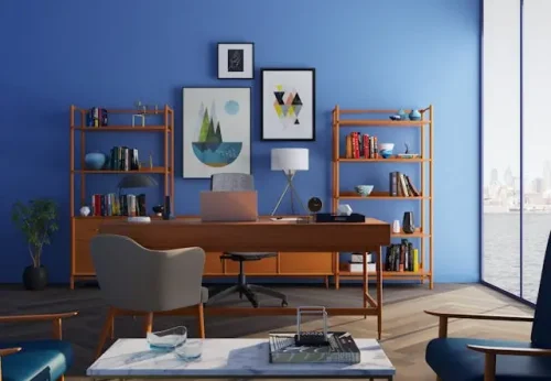
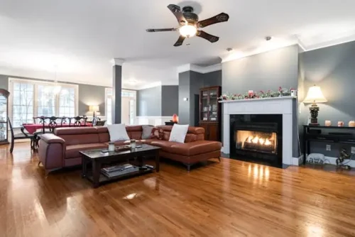
Living rooms often benefit from warm neutrals or inviting colors. Soft whites, warm grays, or gentle yellows create a welcoming environment. For those who prefer a bold statement, deep blues or greens add personality without overwhelming the space. Home offices—adapting your home to remote work requires focus and productivity. Blue is known to enhance concentration, while greens reduce eye strain. A mix of neutral tones with pops of color helps maintain a balanced and professional setting.
The Best Colors for Relaxation
Calm and soothing colors make the space feel peaceful. Blue is a top choice for relaxation, as it reduces stress and lowers heart rate. It works well in bedrooms, bathrooms, and meditation spaces. Green represents nature and renewal. It brings a refreshing feeling to a room while remaining easy on the eyes. Soft sage, olive, or mint green are ideal choices. Lavender and soft purples create a gentle and calming effect. Unlike intense purple shades, which may feel overpowering, lighter hues add a touch of elegance and relaxation.

How to Prepare Walls for Painting
Proper preparation and cleaning after the move ensures smooth application and a long-lasting finish. Start by removing furniture or covering it with plastic sheets to protect it from paint splatters. Clean the walls thoroughly to remove dust, dirt, or grease. Cleaning after the move is particularly important, as freshly painted walls adhere better to clean surfaces. Follow these steps to get the best results:
- Remove furniture or cover it with protective sheets.
- Clean the walls to remove dirt and grease.
- Use painter’s tape on baseboards, windows, and outlets.
- Fill cracks or holes with spackle and sand the surface.
- Apply a primer if painting over dark colors.
- Ensure proper ventilation for faster drying and reduced fumes.
Energizing Colors for Productivity
Some rooms require a boost of energy. Choosing the right shades for every room, e.g., bold and vibrant colors, can help stimulate focus in a workroom. Red increases heart rate and creates a sense of urgency. While it may not be suitable for bedrooms, it works well in dining rooms and exercise spaces. Yellow is associated with happiness and optimism. It brings warmth and energy, making it ideal for kitchens and home offices. However, bright yellow may cause eye strain, so softer shades work best. Orange combines the warmth of red and the brightness of yellow. It encourages enthusiasm and creativity, making it suitable for workspaces and playrooms.
Neutral Colors and Their Versatility
Neutral colors offer flexibility and timeless appeal. They serve as a base for any design style and pair well with both vibrant and muted tones. If you are trying to make a meditation space in your home, neutral colors are also a great choice. White enhances brightness and makes small spaces appear larger. It works well in minimalist designs and pairs with any accent color. However, different shades of white may have warm or cool undertones, affecting the room’s overall feel. Gray adds sophistication and depth. Lighter grays create an airy feel, while darker grays add a sense of drama. Gray works in bedrooms, offices, and living spaces. Beige and taupe provide warmth without overpowering a space. They suit traditional, rustic, or modern interiors, offering a neutral foundation for furniture and decor.
Creating the Right Mood with Color Combinations
Combining colors enhances a room’s aesthetic and mood. Complementary colors, such as blue and orange, create contrast, while monochromatic palettes use variations of a single color for a cohesive look. Accent colors add personality. A neutral space with pops of bold color, such as a deep blue couch in a white living room, creates a striking effect. Layering different shades prevents a room from feeling flat. Mixing light, medium, and dark tones within the same color family adds dimension and interest.
Read More: Ways To Make A Small Bathroom Feel Larger & More Spacious
Adapting Color Choices Based on Lighting
Lighting influences how colors appear. Natural light reveals true tones, while artificial lighting can change a color’s appearance throughout the day. North-facing rooms receive cool, indirect light. Warm beige or soft yellow tones prevent the space from feeling cold. South-facing rooms get plenty of natural light. Almost any color works, but cooler tones balance out the warmth from sunlight. West-facing rooms have warm light in the afternoon. Soft blues or greens counteract the golden hue of the evening sun. East-facing rooms receive morning light. Soft neutrals and pastel colors enhance the gentle, warm glow.
Conclusion: Choosing the Right Shades for Every Room
Colors influence how a space feels and functions. Understanding the psychology behind different shades helps select the best room options. Soft blues and greens create calm environments, while bold reds and yellows add energy. Neutral tones provide flexibility and timeless appeal. Lighting, personal preferences, and intended room functions guide color choices. Testing samples before making a decision ensures a satisfying result. By choosing the right shades for every room, homeowners create spaces that feel comfortable, inviting, and suited to their needs.